Posts

EXP3 submission

Image
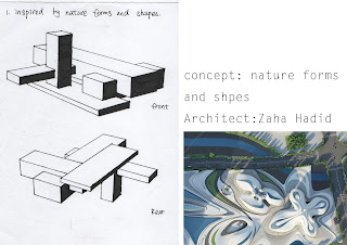
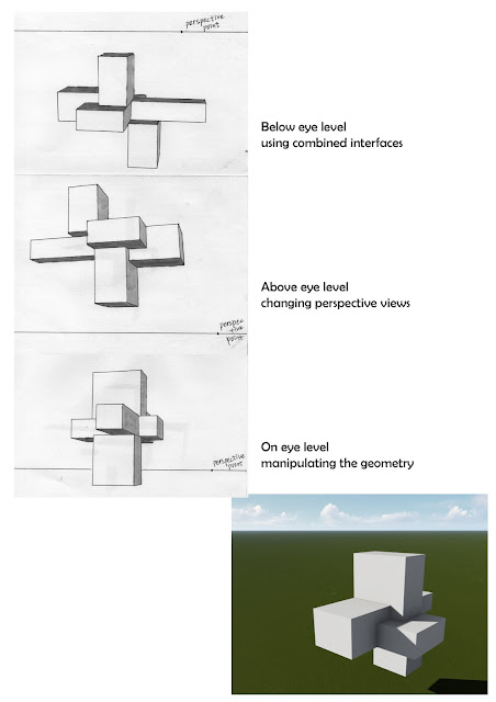
Theory and references GEOMETRY Views and inspiration caused the geometry of the shape INTERFACE Interacting with different perspected interfaces Customize Range of materials to customize the appeal of the design Using different geometry shape and interface of the solid difference customize a unique combination architecture. Reference: kilkelly, m. (2016).  5 Ways Computational Design Will Change the Way You Work - ArchSmarter - . [online] ArchSmarter. Available at: http://archsmarter.com/computational-design/. 18 sketches Two point perspective drawing 36 CUSTOM TEXTURES  Moving element in the sketch up model 1. First moving element is incorporated on the bottom of the bridge. It has panels that slide in and out from underneath the walk path. This also reflects the unique oscillating shape of the building.    2. The second moving element is a roof piece. It rotates angles continuously while also absorbing energy

weekly work

Image
Week 1: 18 sketches Theory and references GEOMETRY Views and inspiration caused the geometry of the shape INTERFACE Interacting with different perspected interfaces Customize Range of materials to customize the appeal of the design Using different geometry shape and interface of the solid difference customize a unique combination architecture. Reference: kilkelly, m. (2016). 5 Ways Computational Design Will Change the Way You Work - ArchSmarter - . [online] ArchSmarter. Available at: http://archsmarter.com/computational-design/. Week 2: Two point perspective drawing Moving Elements: 1.  https://youtu.be/4iqnA-ixRZs 2. https://youtu.be/rkODNdRm7u4 Week 3: Plan and sections Week 4: 36 custom textures chosen of 3 textures:  marking schedules

week 3 final design

Image
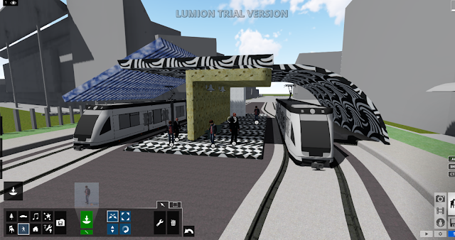
Our concept was to design railway station that allowed easy access for both students and staff. it should be convenient and efficient. Therefore my goal was to design a place where a lot of passengers could fit but minimizing the space needed to use that. by doing so i allowed only one train for either side of the station and different colored and texture roofs. the point of the roofs is to avoid confusion on which side to go on and to keep the passengers orderly and controllable.  In this first image I incorporated a lot of utilities for the people such as seats, lights and bins. I gave a shot where you could see both textures of the roof and different materials. ones glass and the other marble. The image above draws your attention to the man standing in the tunnel of the smaller square. Its intended for the audience to look that way due to the larger square having a smaller square inside it like a magnifying glass and our curiosity to see whats inside. this shot sh

36 custom textures

Image

week2 stetches

Image

the lumion design

Image

6 axonometrics

Image